The Bridge Page That Cut My Cold Native Lead Costs by 38%
I remember staring at a Taboola dashboard at 11 p.m., refreshing it like it owed me money. Clicks were coming in. Plenty of them. Leads? A trickle that cost more than I'd budgeted, and the margin I'd penciled in was gone.
If you've run cold native traffic to an affiliate funnel, you've probably had that exact night. A lot of us have been through it, and almost nobody talks about it honestly, because the loud corners of this industry only post the wins.
So here's the unvarnished version. Adding a pre-sell bridge page between the ad and the opt-in cut my cost per lead by roughly 38% in my test. It wasn't magic, and it wasn't instant. I got it wrong twice first.
The Shared Struggle: Cold Clicks Don't Owe You Anything
My original setup was the one most of us start with. A native ad with a curiosity headline, a click straight to a lead capture page, then an email sequence pushing a ClickBank-style offer. Simple. Clean. Broken.
The problem wasn't traffic quality, though that's where I pointed the finger for weeks. The problem was a mismatch in readiness. Someone browsing an article feed at lunch isn't shopping. They clicked because a headline poked at something. Then I asked for their email before giving them a single reason to trust me.
What most people get wrong is treating the click as intent. It's not. It's a flicker of curiosity, and it dies in about four seconds if the next page feels like a toll booth.
I blamed the creative. I blamed the publisher mix. I blamed the offer. I even blamed myself for not being "good enough" at this, which, honestly, is the part that stings most and gets mentioned least.

What I Changed (and Why It Wasn't Complicated)
A bridge page is a short pre-sell step that sits between the ad and your capture page. Its job is to continue the conversation the ad started, build a little context, and let the visitor opt themselves in mentally before you ask for anything.
I'd read plenty on this, including the 3-step pre-sell framework we published, and I'd nodded along without actually building one. Classic. Reading about a fix isn't the same as shipping it.
My first bridge was a short, story-led page. About 350 words. One image. One button. It picked up the exact angle from the ad headline and answered the question the ad raised, partially. Not fully. That gap matters.
The three pieces I kept
- Message match. The bridge headline echoed the ad's promise almost word for word.
- A small, honest story. Not a fake testimonial. A plain explanation of the problem and why a certain approach made sense.
- One low-friction next step. A single button leading to the opt-in, no navigation, no footer links.
What Didn't Work
Version one flopped. I wrote it like a mini sales letter, long on claims and short on usefulness. Visitors bounced faster than they had before, which taught me something humbling: a bridge that sells too hard is just a slower, more annoying landing page.
Version two had a pop-up on the bridge itself. Terrible idea. It undid the whole point, because I was demanding commitment before earning it.
The counterintuitive part? Version three was shorter and less promotional. I cut the hype, added two paragraphs of genuinely useful explanation, and the lead cost finally moved. If you've seen a similar story in our look at why cold clicks ghost your offer, you know this pattern: warmth beats persuasion with cold traffic.
Real-World Implementation Notes
Here's the workflow I'd hand a friend who asked me over coffee. It's what I actually did, trimmed of the false starts.
- Hold everything else constant. Same ad creative, same publisher whitelist, same daily budget. I split traffic roughly 50/50 between the direct opt-in and the bridge version.
- Run it long enough to mean something. I let each side collect a meaningful batch of leads rather than judging after two days. Native traffic swings with time of day and publisher, so early reads lie.
- Watch cost per lead, not click-through alone. My bridge page actually lowered the number of people reaching the opt-in. But the ones who arrived were far more likely to convert, and I was paying for fewer wasted form views.
- Check lead quality downstream. A cheaper lead that never opens an email isn't a win. I tracked open rates on the first two emails of the welcome sequence to be sure.
A few observations from the field. Mobile mattered more than I expected, since most native traffic is on phones, so I rebuilt the bridge mobile-first and tested the button position above the fold. Page speed mattered too. A heavy builder template cost me visitors before they even read a word.
On tooling, I built the bridge in systeme.io because it was fast to edit and cheap to test. If you're weighing builders, our comparison of ClickFunnels and Systeme.io for bridge pages covers the tradeoffs. Visit the platform's site to see current features and pricing, since those change.
Why the Lead Cost Dropped
I can't promise you'll see 38%. Your offer, your vertical, your traffic source, and your execution all shift the outcome. Mine landed there in my test, and I'd treat that as one data point, not a benchmark.
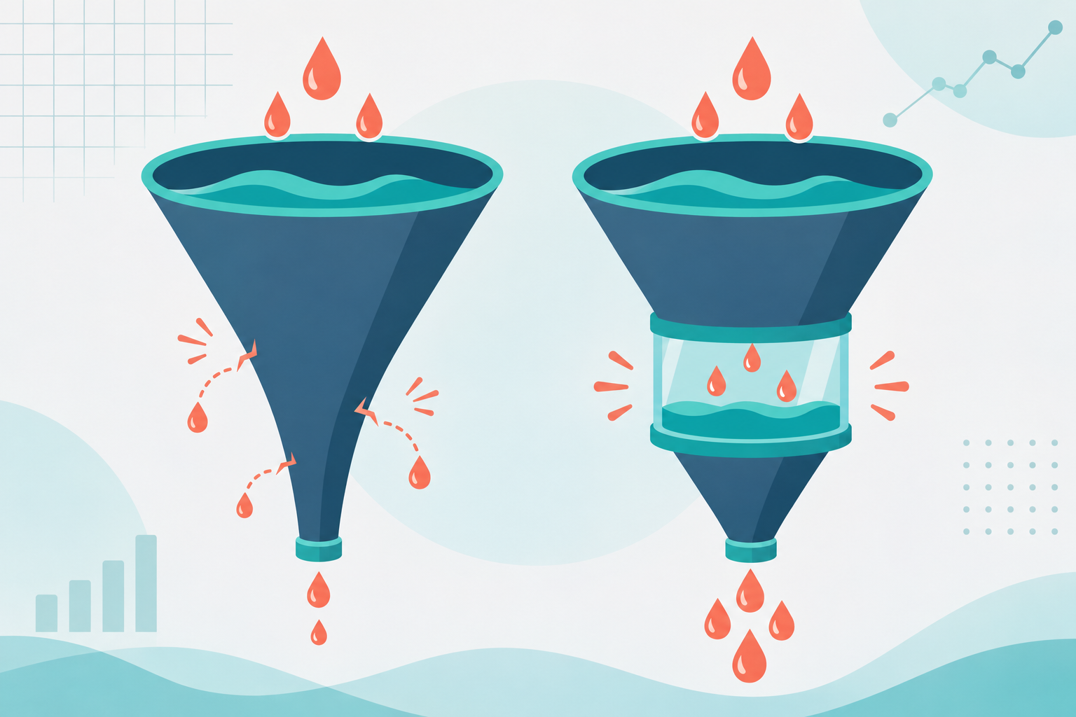
But the mechanism is something I trust. The bridge filtered out the idle clickers who would never have opted in, and it warmed up the rest. You pay the same per click. You just stop paying for the people who were never going to say yes.
| Direct opt-in funnel | Bridge page funnel |
|---|---|
| Asks for email immediately | Builds context first |
| Higher form views, lower conversion | Fewer form views, higher conversion |
| Curiosity fades at the form | Curiosity gets a payoff |
| Hard to diagnose drop-off | Extra data point on interest |
What I'd Do Differently
I'd have built the bridge first, not last. I spent weeks tweaking ad creative when the leak was one step downstream.
I'd also skip the sales-letter instinct completely. Early on I thought a bridge needed to be persuasive. It needs to be useful. Persuasion comes later, in the emails.
And I'd tell myself it was okay to feel lost during those first failed tests. Most of us do. Nobody posts the screenshot of the version that lost.
One more thing: I underinvested in the email side at first. A bridge gets you cheaper leads, but if your welcome emails land in spam, you've just optimized the front of a leaky pipe. If you're sorting that out, this breakdown of email platforms for affiliates is worth a read.

Takeaways You Can Use This Week
- Match the bridge headline to your ad promise nearly word for word.
- Keep it short, roughly 250 to 400 words, and mobile-first.
- Teach something real. Don't pitch.
- One button, no navigation, no pop-ups.
- Split test against your current funnel with everything else held steady.
- Judge on cost per lead and early email engagement.
One Last Word
If your cold native funnel is bleeding money right now, you're not bad at this. You're probably just asking too much too soon. I was.
Build the bridge. Test it honestly. Report back to someone, even if it's just a friend in the same grind. We figure this stuff out faster together, and the version of you who's still testing a month from now is already ahead of the one who quit.
This article contains affiliate links. We may earn a commission at no extra cost to you. Full disclosure.
Editorial Team
Senior Digital Marketing Strategist
The Prophet Visionary editorial team covers affiliate marketing, paid traffic, funnels, and digital product strategy with hands-on practitioner experience.
Learn more about our editorial team →Your Traffic Is Only as Good as Your Follow-Up
You're paying for clicks — but are you capturing emails and automating sequences? AWeber makes it dead simple to turn paid traffic into a monetized email list.
See How AWeber WorksThis page contains affiliate links — I may earn a commission at no extra cost to you.
Disclaimer: The information on this site is for educational purposes only and does not constitute financial, legal, or business advice. Results vary based on individual effort, market conditions, and other factors. Always do your own due diligence before making business or investment decisions.